Showing posts with label Runway to Room. Show all posts

Thursday, February 16, 2012

Runway to Room | J.Crew + Steven Gambrel

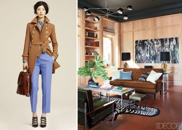
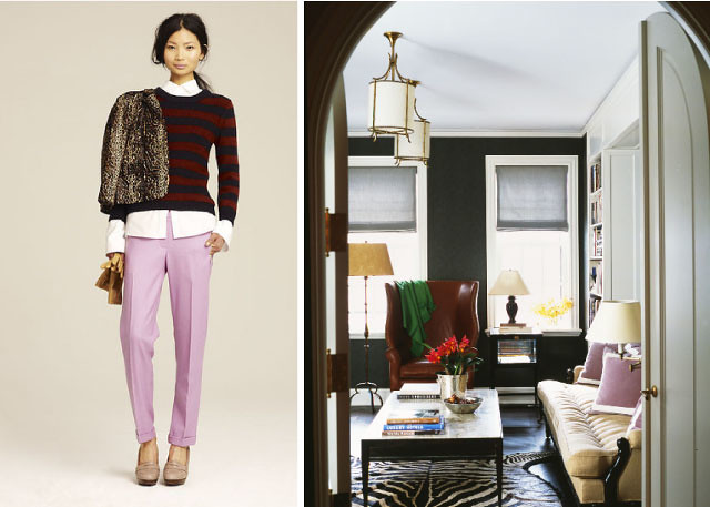
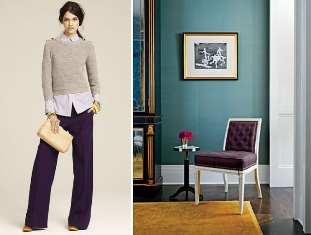
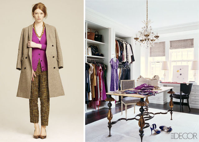
Offbeat, mix-and-match layering, loads of saturated hues, classic prints and scrumptious textures – I can’t help but notice the similarities between the looks in J. Crew’s Fall presentation and designer Steven Gambrel’s interiors.  J.Crew's head designer Tom Mora, who was inspired by photographer Irving Penn, perfected the brand's classic eclectic-preppy aesthetic and created a plethora of perfectly tailored pants that rival Gambrel's line of custom upholstery.  These looks have me praying that Jenna Lyons' interior obsessions and dreams of a J.Crew home line come true!  


Thursday, October 6, 2011

Bold + Bright


Feeling inspired by these incredible looks...

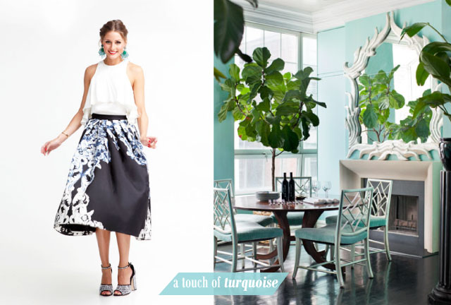
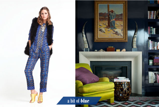
The always stylish Olivia Palermo rocking my coveted Tibi Rococo skirt in Elle Japan and Veronica Swanson Beard's Manhattan Penthouse designed by Thomas Britt.  I posted about the interiors used in the Veronica Beard fashion label lookbook just last week so I was pleasantly surprised when I opened up the October issue of Bazaar and found her lush, vibrantly hued pad.

What a living...

(images via Tibi and Ditte Isager for Bazaar)

Friday, September 16, 2011

I've Found my New Calling...

Right now I feel like that guy from the Stanley Steamer commercial...you know, the guy that says, "Now, I mean I wouldn't say I'm a doctor. But I wouldn't say I'm not a doctor, either".  Replace "doctor" with color trend forecaster and that would be me...totally kidding!

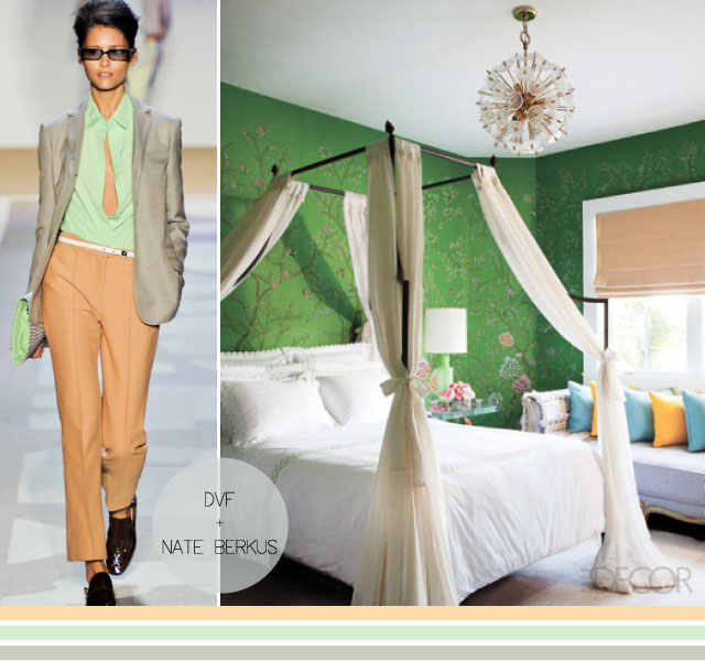
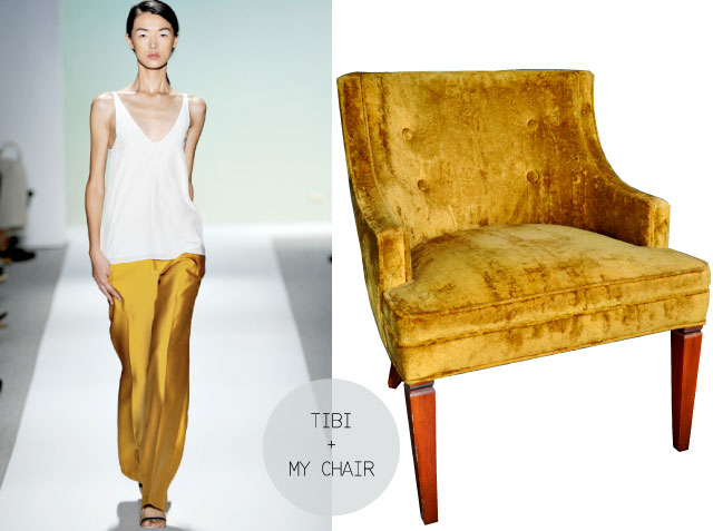
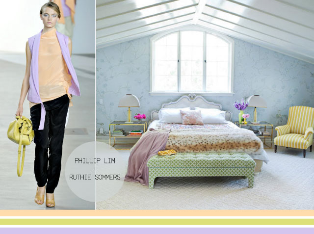
But seriously, I was pleasantly surprised to see some of the strange color schemes I've been blogging about hit the spring 2012 runway.  Take the mint + peach combo above.  I got some mixed reactions/comments when I posted about it here but just look how chic it looks in this DVF ensemble.  And the color of the Tibi pants picture below is dead on with the color of the chair I inherited from my Great Aunt.  Then there are the lovely frosty pastels from Phillip Lim's collection that look like they were plucked right out of Ruthie Sommers bedroom (posted about here).  Needless to say, there were a lot of color schemes that I would have never thought of but that I hope to use as inspiration for future projects...

Wednesday, August 17, 2011

Fashion + Furniture

081711_Aunt-Rita's-Chair2
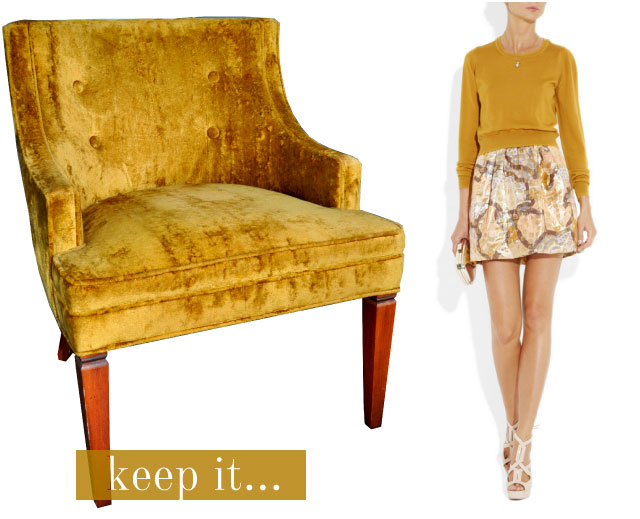
OPTION 1:  Keep It.  I'm not sure what you'd call this color but according to Chloé it's "sunflower- yellow" ...love the color but not sure how I feel about the crushed velvet.

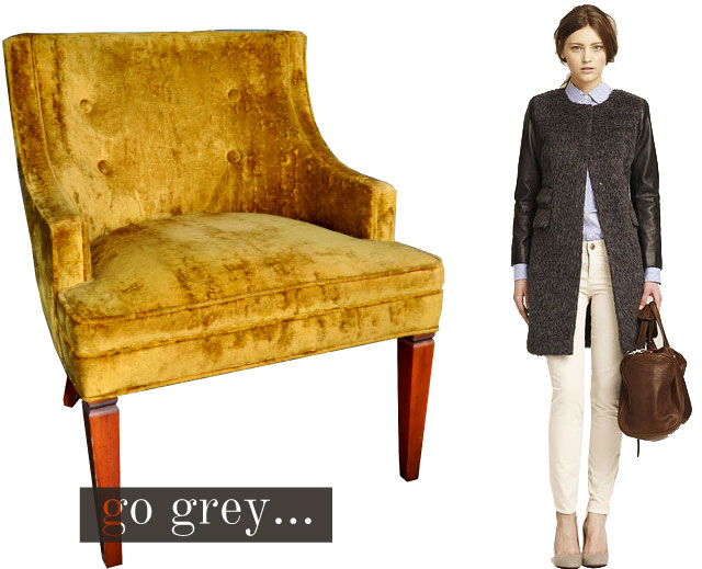
I inherited a pair of these chairs from my Great Aunt and have been contemplating reupholster them.  At first I didn't really like the color but now, after 2 years of living with them, it's really starting to grow on me.  Most of the furniture in my apartment is neutral - light grey linen sofa, jute rug, carrara marble tulip table, chocolate brown leather ottoman - so these chairs add a nice dose of color to the space.  I 've decided to keep the walls of my apartment white (thanks to your great comments!) so now I need to focus in on a design scheme and color palette.  For that I turn to fashion.... 081711_Aunt-Rita's-Chair4 OPTION 2: Go (charcoal) Grey.  This look from the J. Crew Fall 2011 lookbook pretty much sums up my style.  A classic blue tailored oxford, a textured coat and an amazing chocolate brown leather bag (the same color as my ottoman).  I like this option BUT it might be too safe.
081711_Aunt-Rita's-Chair3
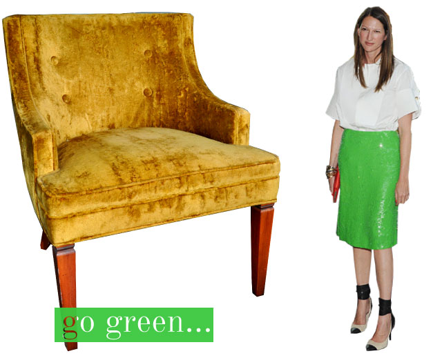
OPTION 3: Go Green!  A bold choice but I love it.  To break it down, white shirt = white walls, green skirt = green velvet chair, black shoe straps = black lampshades...you get where I'm going? 

So now I ask you, dear readers, which look do you prefer?  Any input would be greatly appreciated!

Monday, May 23, 2011

The Art of Oscar

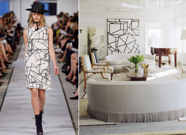
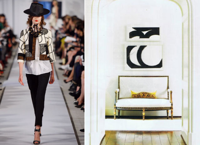
I’ve been meaning to post about Al Held's large scale expressionist black and white paintings for quite some time but never got around to it…then I saw Oscar de la Renta’s Resort collection – with its bold patterns and beautifully structured shapes – and couldn’t help but notice a resemblance. Uncanny, no?  I love how both Held's paintings and Oscar's prints are modern yet work so well with classic, tailored pieces. This fusion of modern and elegant is a dazzling combination I just can’t seem to get enough of...
Images: Style.com, roger davies for western interiors april ’09, design by c. renea abbott via This is Glamorous

Tuesday, April 19, 2011

Runway to Room | Poppy Print

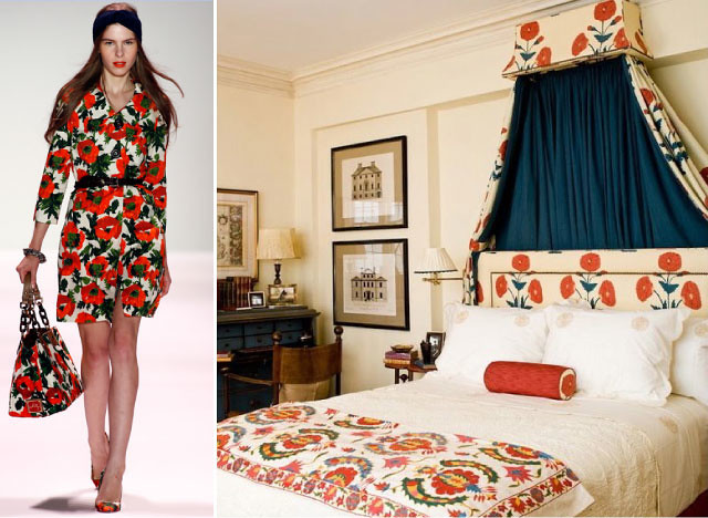
So I know I’ve blogged about my love for solid textiles a couple of times now, but these prints are giving me serious heart palpitations. Michelle Smith and Sara Gilbane’s designs embody a modern sensibility and vintage vibe that I simply can’t resist. Their ability to give new life to traditional pieces with modern fabrics and styling is quite inspiring. Here, Michelle paired a tailored floral coat with a turban and Sara updated a classic corona with a bold poppy print (Lallarookh by Brunschwig & Fils) and a coordinating suzani. I never would have thought of mixing saturated florals and tribal elements but these look prove it can be done…and look chic!
Images: style.com and sara gilbane

Thursday, March 31, 2011

Runway to Room | J. Crew + Nate Berkus

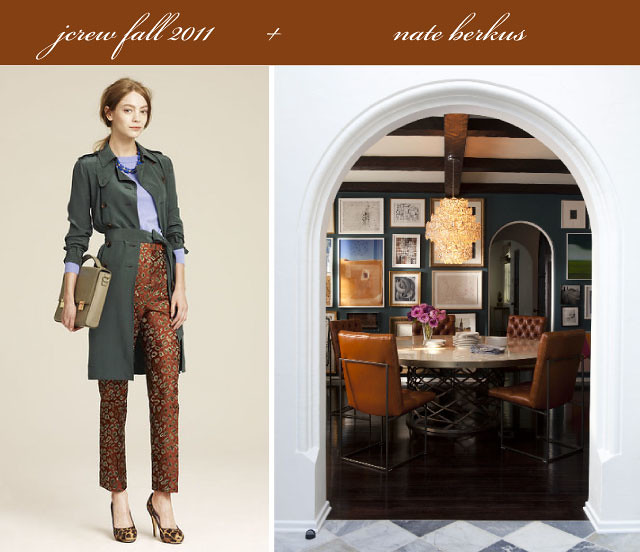
Those who know me personally know that despite the bright, patterned and girlish content of this here blog, my own personal style is far more tailored and subdued.  Over the years, I’ve wasted more money than I’d like to admit on trendy patterned pieces only to wear them once then ban them to the “someday” bins under my bed.  Take a look at my closet and apartment today and the only patterns you’re likely to see are stripes, ethnic prints and those of the animal variety (they’re classic and go with anything!).  My bedding – white.  My sofa – grayish.  My throw – fur.  My rugs – sisal.  I stick with saturated, textured solids that I can mix and match to create a cozy, layered feel. Was I tempted to hop on the Imperial Trellis train? Yes sir! Am I glad I didn’t? You bet!  I'm a girl on a budget so I leave patterns for pillows and other small accessories.  For this reason the colorful yet tailored pieces from J. Crew’s fall line and Nate Berkus’ always scrumptious layered interiors have me weak in the knees. Who can resist unexpected combinations of rich saturated colors and luxe-looking designs that are sure to stand the test of time? Not me....
images: fabsugar, nate berkus and roger davies for elle decor

Wednesday, February 9, 2011

Cool to be Classic: Céline + Netto

One of the greatest struggles of getting dressed this time of year is striking a balance between looking good and staying warm. The art of putting together chic, cool weather outfits is underrated. Leave it to Phoebe Philo at Céline to get it right. Miss Philo's 2010 pre-fall collection embodies winter-chic at its finest. Silk blouses, brightly colored wedges, high-waisted, wide-legged tailored trousers and smart uses of fur, who would have ever thought that classic minimalism of this type could once again look so fresh? This made me think, could lux-low key essentials and classic minimalism translate into an interior? The Answer is yes.
By now, we've all seen this iconic shot of David Netto's bedroom in his New York apartment.  The beauty of it, at least to me, is that it's so unexpected. There's that very traditional hand-blocked wallpaper mural by Zuber paired with that sleek chrome bed and Regency mechanical table.  Then there's the room's rather spare color scheme of blue, white, brown and a pop of orange.  This room is beautifully edited yet still seems livable and comfortable.  And just like the Céline collection,  it perfectly bridges the gap between traditional and modern.  With proof that classics are cool, lets all channel these looks as the last weeks of frigid temps loom, shall we?

Friday, January 14, 2011

A Pop of Color

If there was ever a collection of dresses that I wanted immediately, this would be the one. The Max Mara Elegante Spring 2011 ad campaign features the gorgeous Siri Tollerø donning the label’s soft, feminine and airy ensembles done in the perfect shades of pink, green and yellow.  Adding any one of these lovely hues to your home would surely rid it of the winter blues. I can only image how happy I would be if I woke every morning in the bedroom pictured above.  I'm loving the pop of the yellow headboard in this otherwise restrained room.  One of my current obsessions includes dark, cozy dens - the perfect winter escape.  So I'm loving this David Hicks designed room...the mood, the art, the color....pure perfection...
There is something about this femine frock (I love the bow!) that reminds me of this gorgeous bedroom by Artist Julian Schnabel.  How pretty are those curtains?  I love how the fuschia walls make the intense greens of Picasso's Femme au Chapeau look even more vibrant.

Wednesday, December 1, 2010

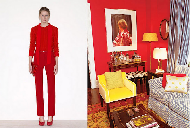
Red


Albert Hadley once said that there should be at least one red accent in every room. I couldn't agree with him more. Red is such a powerful color that can instantly add energy and drama to a room.  It feels daring and bold, while at the same time warm and intimate.  Red walls add spice while red furniture catches your eye. While in a neutral environment red can be used through accent pieces like a lamp, a cashmere throw, or a bunch of red roses.  It works well with other colors, particularly yellows and blues ( I love it with cadet blue, like the curtains above). For interiors, some use the color proudly, such as Nick Olsen, while others use it in a more subtle way. However you choose to use it, perhaps you might find some inspiration in the photos above.  On the left is a monochromatic red outfit from the Céline fall 2010 lookbook and on the right, Andy and Kate Spade's cozy, red den.  To me, this room is supremely chic, the red is perfect and the canary yellow chair sings to me!

Wednesday, September 8, 2010

Runway to Room: Camel + Chloé

The link between fashion and interiors is a strong one. The colors, fabrics and textures that are current in one of these areas of design often crossover easily to the other discipline.  That said, it's no news by now that the paler shades of brown have become fashion's mainstays of the season. It seems just as the interior design world moved away from the indistinct colour scheme of beige, beige and more beige the fashion world jumped back on the train.  Below is an example of a living room that echos recent runway looks by Chloé, so if you want to infusion a little Fall 2010 into your living room, here is a good start...  


This room, designed by architect Gil Schafer and interior designer David Netto, shows camel done right. Mixed with aubergine lacquered walls, patterns, a pop of color, a touch of gold, and brass hardware, beige never looked so good!

Image Credits: Chloé, 1st Dibs